Tuesday, September 29, 2009

photos of the interior


Hallway leading to StoryCorps - the angles of the walls drew my eyes into the space


The stairs lent a sense of rhythm but were unique in that they led up at an angle to the wall


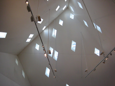
Structures hanging from an upper wall


Interior of the cube structure


Close-up of a window - inspiration for solid/cavity sketch


Facing door to Jew on Vinyl exhibit - geometric door area represents proportion


These benches helped me analyze the figure/ground relationship


The front lobby


Recurring angles also represented in the gift shop

more vignettes


rhythm

The pattern on the window represents a sense of rhythm and uniformity.


scale/proportion

I used the figures to show that there is a definite sense of proportion in the design of the door.


scale/proportion

The door to the Jew on Vinyl exhibit had some definite characteristics of scale and proportion.


Museum - wide shot photos


View with details of both cubes and open space


Lots of green


From the left, we are able to better appreciate the plants.


Wanted to get it all in - view from in front of Yerba Buena


Wider shot


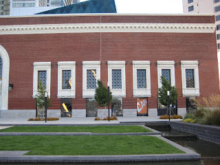
Brick building - photos


Detail above exit


Exit door


Entrance to the museum


Windows, grass and water


From this angle, the cube and building almost have no relation to each other.


View of detail of partial cube on roof, along with enclosed plant area

more vignettes


figure/ground

The benches outside the Jews on Vinyl exhibit seemed perfectly in place in relation to the angles of the walls around them. The figures wouldn't make as much sense without the ground.


solid/cavity

Trying to emphasize the weight of the solid and the light of the cavity.


perspective

The angles led my eyes directly down the hall and emphasized the perspective.


rhythm

The steps and the notches on the handrail created a sense of rhythm.


rhythm

The windows, steps and benches in the open space outside of the museum all create a sense of rhythm.

Cube shots - photos of the Contemporary Jewish Museum


exterior: gift shop and main "cube"


close up of diamond pattern and windows


worm's-eye view

September 23rd, 2009

This week we focused again on our vignettes, which will eventually be pieced together to create a map of our building.

We are expected to be able to tell why we think certain things about our building, for example if we think the building is ugly we have to be able to explain "why?". The book Experiencing Architecture helps us to relate to buildings of the past by giving us examples of inspiration from the past which have helped redefine or create new structures.

Solids and cavities: a doorway can lend a feeling of being in a cavity; you cannot create cavity (hollow, void, shadow, enclosed/ cave -> rock, cavernous -> echo) without the solid aspect; similarly, we must understand disorganization to understand organization; solid/void; figure/ground.

History: exploration of people and culture, how they live, what their values are, their technology; how these things have changed over time --> ultimately, how can we create architecture that fits into the lives of specific peoples' needs? As history changes, so does art and architecture --> it's a process/ it's progressive; grandeur of scale changes with peoples' needs (classical structures were built for the gods, and today's houses have shrunk - absence of God?).

In today's society, structures are scaleless:
THEN (classical): scale, proportion; gods, nature (untamed); grandeur, mass; fear, power, awe; stage; math, organization, golden section; beauty, perfection; sculptural (reaching to the heavens)
B/N THEN & NOW(gothic): structure, organization, columns; sculpture; technology, light (a different kind of reverence - reaching to the "heavens")
NOW (mannerist): scaleless; ornamentation (technology, steel, glass); digital design; rules, godless, chaotic, monotonous; skyscrapers (reaching for the heavens in a secular way)

Are we back to Gothic? --> intimate space, divine beauty, individualism (we don't use our bodies as scales anymore - as Le Corbusier did), technology, movement of space
  • the word support can make us envision different things such as legs or bones (physical) or we might think of emotional support
  • Daniel Libeskind's work is appealing/ successful because he deals with things in the emotional realm ("support"); his lines are a conscious effort to tell a story; his lines are based on symbolism
  • modernism - "palate cleansing" --> clean?
  • form follows function
  • why paint brick? - paint can take away from the honesty of a material
  • Le Corbusier - started to create Modernism; connected to nature (what you take, you put back)
  • technology is allowing us to be disorganized
  • if you can draw "beautiful", how can you draw "unbeautiful"?

Tuesday, September 22, 2009

vignettes


space/cavity & rhythm

This sketch represented more than one of the concepts we discussed in class. The windows in the cube-like structure against the dark veneer captured the concept of space and cavity for me. The pattern of diamonds is also very representative of rhythm.


hard/soft

The sculptural design of cherubs and decoration represented the concept of hard and soft to me. The stone is a hard medium, worked to look soft in the forms of cherubs or children and curvilinear lines.


hard/soft

The juxtaposition of water, grass and stone create a seemingly conflicting but ultimately harmonious effect. The hard lines of the ground are softened by the water which seems to flow over the edges and the bright patches of soft grass.


Monday, September 21, 2009

September 16th, 2009

Today's class focused on the visual process, i.e. using words to describe a building. We have to train ourselves to marry lines and language. We also talked about how every period was/is the antithesis of the period preceding it: from Classical to Renaissance, Baroque to Rococco to Mannerism, etc. We must ask ourselves how our building fits into the context of history and think about how critical architecture represents society.

Other topics we touched upon:
-being intellectual about architecture
-animism
-support (vertical, horizontal, cantilevered)
-thinking while drawing
-Frank Lloyd Wright's love of nature (he used low ceilings to emphasize this) and the horizontality of it
-the importance of controlling or emphasizing/exaggerating ideas vs. trying to keep with standards
-the meaning of MODERN (modernism): a train of thought, a way of thinking --> post/beam technology, materials (glass - light, transparency; steel - skyscraper), spacious/open landscape, clean lines, revealing
-Post-Modern Theory as a return to ornamentation (classic elements with ornamentation)
-the idea of AXIS
-the use of structural forms used as sculptural forms

Chapter II of Experiencing Architecture:

  • p. 35 - seeing requires a lot of us; we must see while thinking about details, relationships, contrast
  • p. 22 - the description of lines (hard/soft, faint/dark, edge (silhouette))
  • p. 47 - figure/ground relationship (taking the in-between spaces of background, white of paper into account); mass (solid) vs. cavity (void); scale and proportion

Tuesday, September 15, 2009

Rhythm

My sketch of the Contemporary Jewish Museum depicts rhythm. The trees, the windows and the spaces beneath the windows create rhythm, shadow and harmony.

Harmony
Shadow
Space
Light/Dark

RHYTHM

Week 3 - Discussion of Chapter 1 (plus heated debate about the Federal Building)

Dark
Shadowy
Deep
Blurred
Curved

INTUITIVE


After moving our chairs into circle formation (I like being able to put a face to a voice) we began the class by drawing vignettes of features of classmates' faces. I guess what we actually had to do was to capture the essence of the features with lines instead of drawing outlines or trying to draw representational images. This was definitely easier said than done.

Chapter 1 - Basic Observations

  • Harmony: time/context; looking towards the future; not revisiting the past (except for inspiration)
  • Architecture as music - proportion (horizontals to verticals), flow, rhythm, acoustics
  • Concept of falsity/falsehood
  • EXPERIMENTATION
  • Utility: function, purpose, architecture vs sculpture, questioning how space will be utilized
  • Architecture as functional art
  • ORGANIZATION
All those things make up part of the experience of architecture. We then went into detail about certain topics:
  • the relationships of the inanimate - our goal is to create experience, create texture, connect spaces
  • reasons for looking to the past include: the past is comfortable, knowing what has worked and what hasn't
  • we can challenge conventions with experimentation
  • analyzing relationships between soft and hard surfaces - undulation, visual tactility, angularity
  • understanding scale and proportion
  • the disharmony between the column and the brick ground on page 26
  • how objects in our lives inspire us to think about architecture

Monday, September 7, 2009

Project #1

I've decided to choose the Contemporary Jewish Museum for my project. I like the mix of classic brick and modern angles. The open space in front of the museum adds greatly to the overall effect of the design.


Picture taken from CJM website: http://www.thecjm.org/index.php?option=com_content&task=view&view=article&id=11